raw_df <- readRDS("rp_201801_202005_df.rds")4 ggplot2
4.1 Preparation
4.2 Scatterplot
First let’s preprocess our data to get production in May 2020 and hours between 10:00 AM and 5:00 PM.
plot_df1 <-
  raw_df %>%
    filter(dt >= "2020-05-01" & dt < "2020-06-01" & lubridate::hour(dt) >= 10 & lubridate::hour(dt) <= 17) %>%   transmute(hour_of_day = lubridate::hour(dt),wind_lic,sun_ul)

print(plot_df1,n=3)
# A tibble: 248 × 3
hour_of_day wind_lic sun_ul
<int> <dbl> <dbl>
1 17 2055. 1442.
2 16 2036. 2523.
3 15 1875. 3402.
# ℹ 245 more rowsLet’s plot licensed wind production against unlicensed solar production for May 2020 for hours between 10-17. We can say that
- Usually during morning time solar production is high and wind production is kind of low.
- Expectedly solar production is decreasing in the afternoon
ggplot(plot_df1, aes(x = wind_lic, y = sun_ul, color = as.character(hour_of_day))) + geom_point()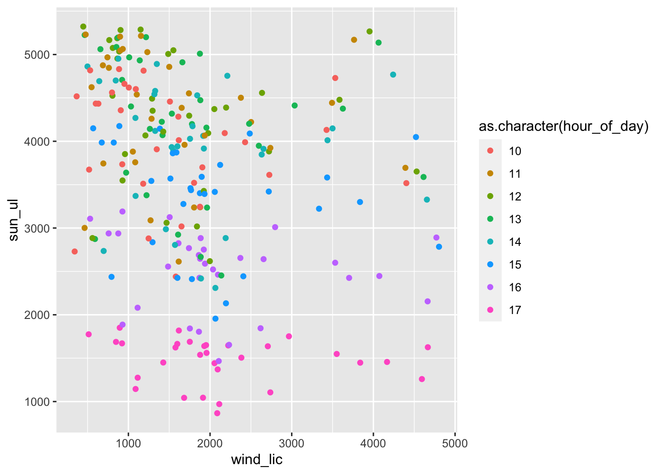
ggplot2 is quite flexible. We can move aes from ggplot object to geom_point object.
ggplot(plot_df1) + geom_point(aes(x = wind_lic, y = sun_ul, color = as.character(hour_of_day)))
4.3 Line Chart
Here I want to compare wind and solar production in a time series plot.
plot_df2 <- raw_df %>% filter(dt >= "2020-05-01" & dt < "2020-06-01") %>% select(dt,wind_lic,sun_ul)

print(plot_df2,n=3)
# A tibble: 744 × 3
dt wind_lic sun_ul
<dttm> <dbl> <dbl>
1 2020-05-31 23:00:00 1434. 0.0582
2 2020-05-31 22:00:00 1577. 0.032
3 2020-05-31 21:00:00 1858. 0.0335
# ℹ 741 more rowsggplot(plot_df2) +
geom_line(aes(x=dt,y=wind_lic,color="wind")) +
geom_line(aes(x=dt,y=sun_ul,color="solar"))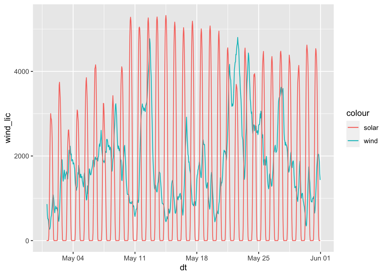
What if I don’t want to repeat geom_line functions? I can use pivot_longer function to get all in a single geom_line.
ggplot(plot_df2 %>% pivot_longer(.,cols=-dt),aes(x=dt,y=value,color=name)) + geom_line()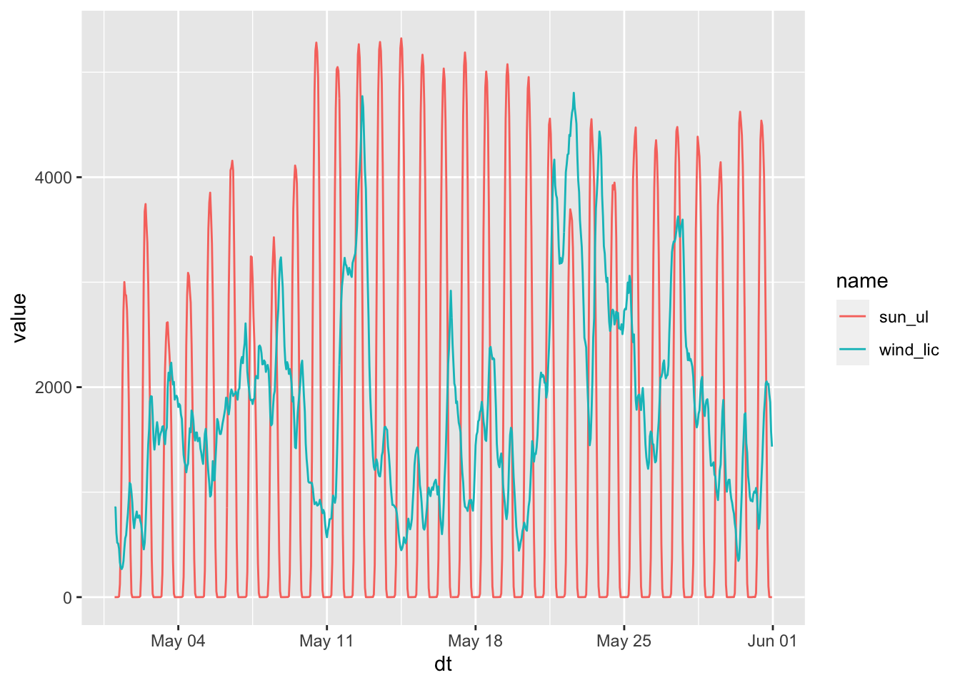
4.4 Bar Chart
Now I’d like to get the May 2020 production and I’d like to differentiate Licensed and Unlicensed.
plot_df3 <- raw_df %>% filter(dt >= "2020-05-01" & dt < "2020-06-01") %>% summarise(across(-dt,sum)) %>% pivot_longer(.,everything()) %>% mutate(type = ifelse( grepl("_lic+$",name),"Licensed","Unlicensed"))

print(plot_df3,n=3)
# A tibble: 16 × 3
name value type
<chr> <dbl> <chr>
1 wind_lic 1346260. Licensed
2 geothermal_lic 654089. Licensed
3 biogas_lic 56839. Licensed
# ℹ 13 more rowsLet’s plot total productions using a bar chart. To improve readability, we reorder by production and differentiate Licensed/Unlicensed using color.
ggplot(plot_df3,aes(x=reorder(name,-value),y=value,fill=type)) + geom_bar(stat = "identity") + theme(axis.text.x = element_text(angle=60,vjust=1,hjust=1))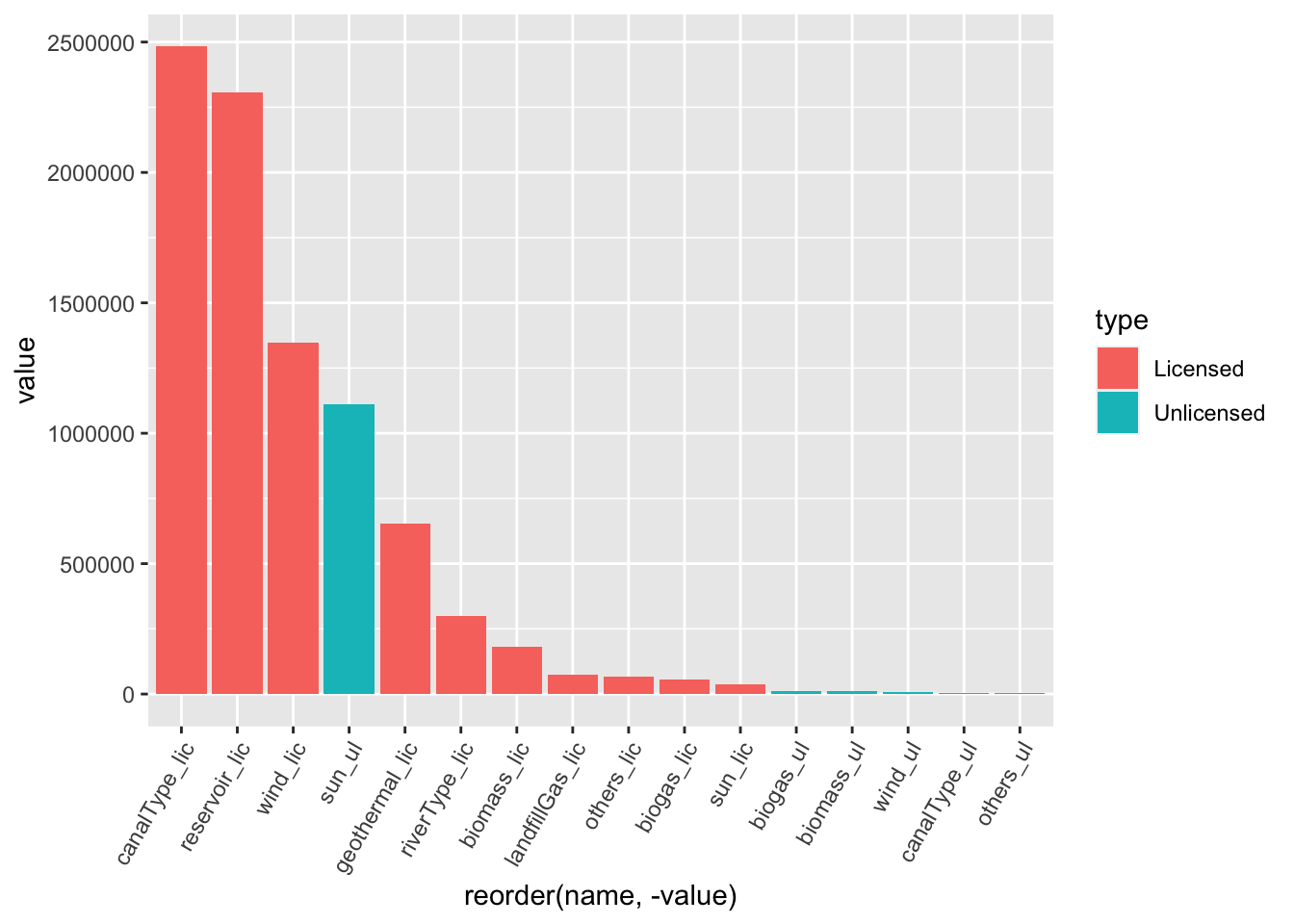
4.5 Pie Chart
ggplot(plot_df3 %>% filter(type=="Licensed"),aes(x="",y=value,fill=name)) + geom_bar(stat="identity") + coord_polar("y") 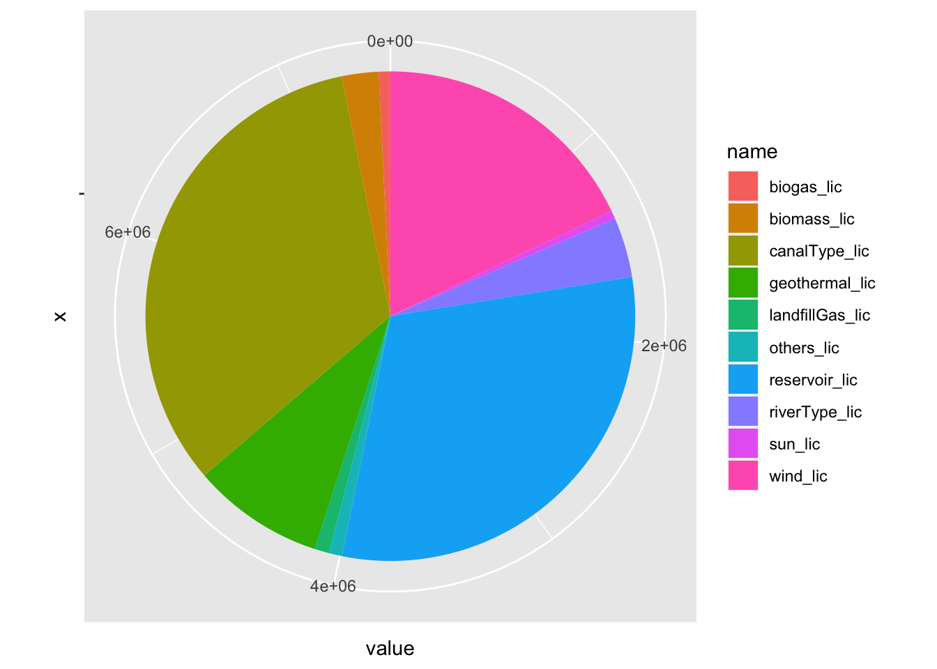
4.6 Theming and Customization
Let’s get our charts better looks!
sc_plot <- ggplot(plot_df1) + geom_point(aes(x = wind_lic, y = sun_ul, color=as.character(hour_of_day)))

sc_plot
sc_plot2 <- sc_plot + theme_minimal()
sc_plot2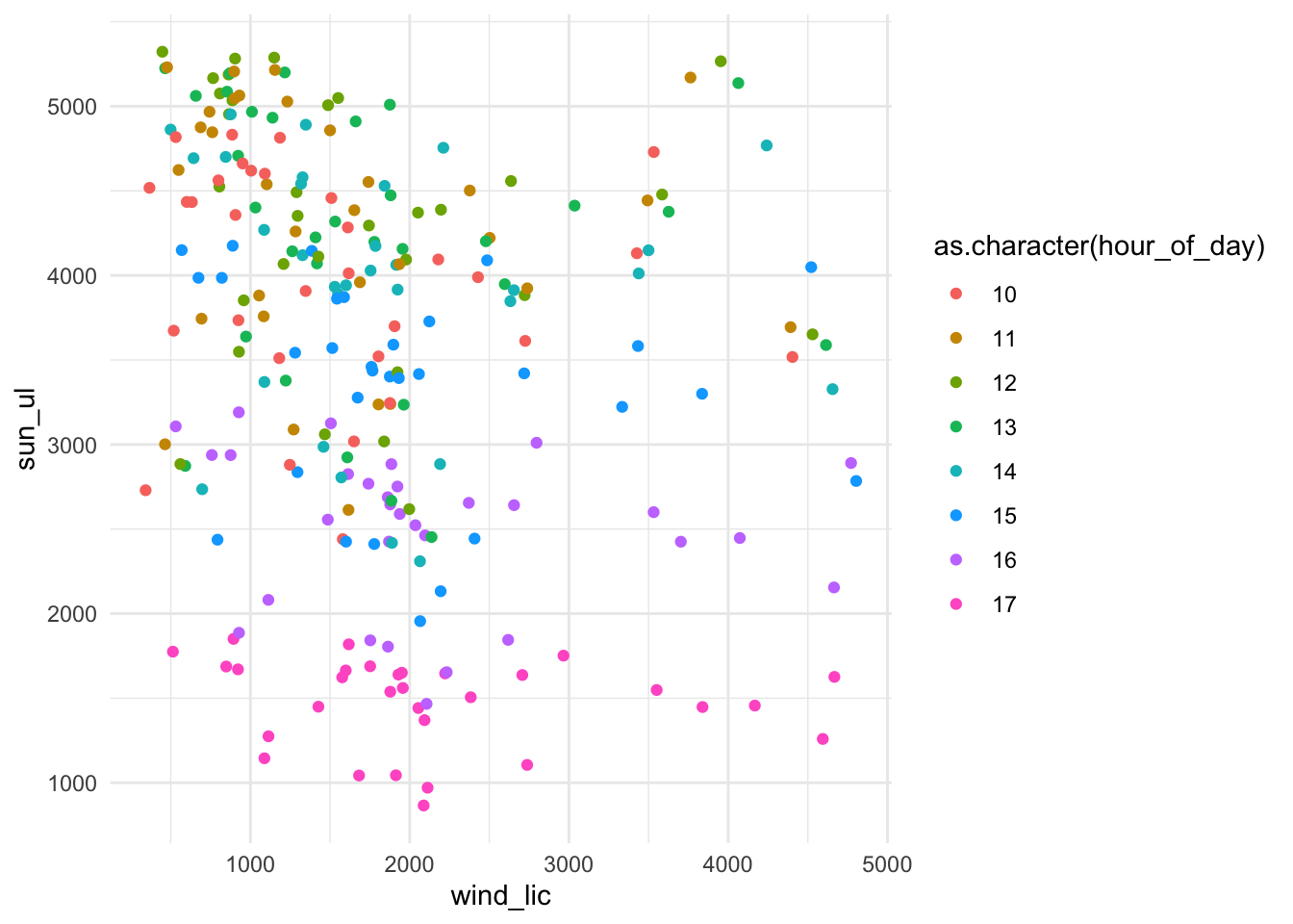
sc_plot3 <-
sc_plot2 + labs(x="Licensed Wind Production (MWh)", y="Unlicensed Solar Production (MWh)", color="Hour of Day", title = "Licensed Wind vs Unlicensed Solar", subtitle = "Renewable production in May 2020, between 10:00-17:00 each day")

sc_plot3
sc_plot3 + theme(legend.position = "top",axis.text.x = element_text(angle=45,hjust=1,vjust=1)) + scale_y_continuous(labels=function(x) format(x, big.mark = ".", decimal.mark = ",", scientific = FALSE)) + scale_x_continuous(labels=function(x) format(x, big.mark = ".", decimal.mark = ",", scientific = FALSE))